Plotly is a platform for making, editing, and sharing customizable and interactive graphs. Embedding Plotly graphs in a R-Markdown document is very easy. Here, we will genarate a R-Markdown document with embedded Plotly charts to visualize regression diagnostic plots similar to the ones generated by using plot() on a fitted lm() object.
R-Studio
First step is to install R-Studio. R-Studio makes it very easy to write R-Markdown documents.
Install Plotly
Run the following command(s) in the console
# Not run
# install.packages("plotly")
# install.packages("MASS")
library(plotly)
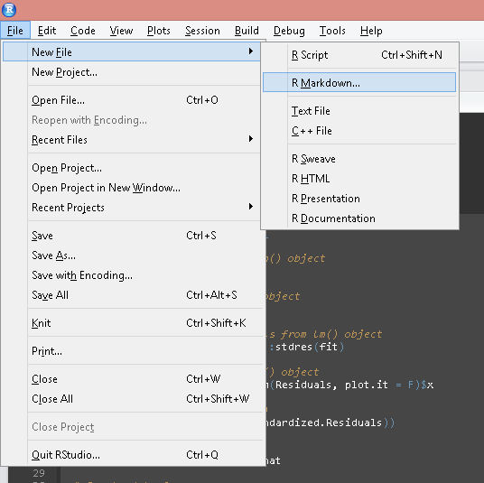
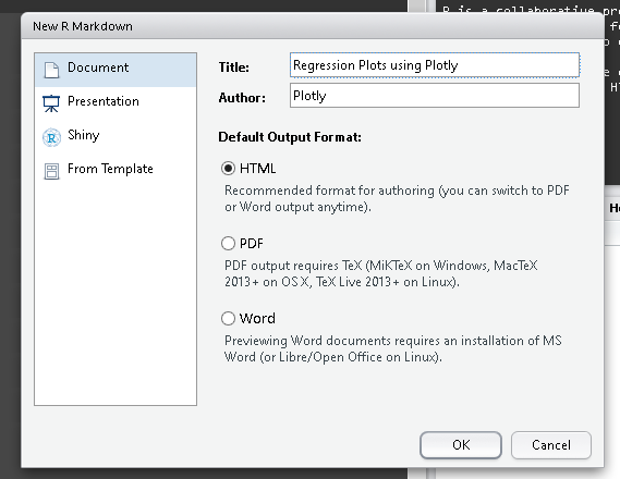
Start a new R-Markdown document
For an introduction to R-Markdown visit http://rmarkdown.rstudio.com/
Image may be NSFW.
Clik here to view.
Image may be NSFW.
Clik here to view.
Function to generate plots
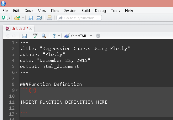
The following code snippet creates a function that accepts a fitted lm() object and returns plotly charts. Paste the following code snippet(s) as chunks in the R-Markdown document as shown.
RegressionPlots <- function(fit){

  # Extract fitted values from lm() object
  Fitted.Values <-  fitted(fit)

  # Extract residuals from lm() object
  Residuals <-  resid(fit)

  # Extract standardized residuals from lm() object
  Standardized.Residuals <- MASS::stdres(fit)

  # Extract fitted values for lm() object
  Theoretical.Quantiles <- qqnorm(Residuals, plot.it = F)$x

  # Square root of abs(residuals)
  Root.Residuals <- sqrt(abs(Standardized.Residuals))

  # Calculate Leverage
  Leverage <- lm.influence(fit)$hat

  # Create data frame
  # Will be used as input to plot_ly

  regMat <- data.frame(Fitted.Values,
                       Residuals,
                       Standardized.Residuals,
                       Theoretical.Quantiles,
                       Root.Residuals,
                       Leverage)

  # Plot using Plotly

  # Fitted vs Residuals
  # For scatter plot smoother
  LOESS1 <- loess.smooth(Fitted.Values, Residuals)

  plt1 <- regMat %>%
    plot_ly(x = Fitted.Values, y = Residuals,
            type = "scatter", mode = "markers", hoverinfo = "x+y", name = "Data",
            marker = list(size = 10, opacity = 0.5), showlegend = F) %>%

    add_trace(x = LOESS1$x, y = LOESS1$y, type = "scatter", mode = "line", name = "Smooth",
              line = list(width = 2)) %>%

    layout(title = "Residuals vs Fitted Values", plot_bgcolor = "#e6e6e6", width = 1000)

  # QQ Pot
  plt2 <- regMat %>%
    plot_ly(x = Theoretical.Quantiles, y = Standardized.Residuals,
            type = "scatter", mode = "markers", hoverinfo = "x+y", name = "Data",
            marker = list(size = 10, opacity = 0.5), showlegend = F) %>%

    add_trace(x = Theoretical.Quantiles, y = Theoretical.Quantiles, type = "scatter", mode = "line", name = "",
              line = list(width = 2)) %>%

    layout(title = "Q-Q Plot", plot_bgcolor = "#e6e6e6")

  # Scale Location
  # For scatter plot smoother
  LOESS2 <- loess.smooth(Fitted.Values, Root.Residuals)

  plt3 <- regMat %>%
    plot_ly(x = Fitted.Values, y = Root.Residuals,
            type = "scatter", mode = "markers", hoverinfo = "x+y", name = "Data",
            marker = list(size = 10, opacity = 0.5), showlegend = F) %>%

    add_trace(x = LOESS2$x, y = LOESS2$y, type = "scatter", mode = "line", name = "Smooth",
              line = list(width = 2)) %>%

    layout(title = "Scale Location", plot_bgcolor = "#e6e6e6", width = 1000)

  # Residuals vs Leverage
  # For scatter plot smoother
  LOESS3 <- loess.smooth(Leverage, Residuals)

  plt4 <- regMat %>%
    plot_ly(x = Leverage, y = Residuals,
            type = "scatter", mode = "markers", hoverinfo = "x+y", name = "Data",
            marker = list(size = 10, opacity = 0.5), showlegend = F) %>%

    add_trace(x = LOESS3$x, y = LOESS3$y, type = "scatter", mode = "line", name = "Smooth",
              line = list(width = 2)) %>%

    layout(title = "Leverage vs Residuals", plot_bgcolor = "#e6e6e6")

  plt = list(plt1, plt2, plt3, plt4)
  return(plt)
}
Image may be NSFW.
Clik here to view.
Create regression model
Let’s create a sample regression model using the mtcars dataset.
fit = lm(mpg ~ cyl + wt + disp, data = mtcars)
Call function
We can simply pass the fitted lm object to the above function.
plt = RegressionPlots(fit)
Plot
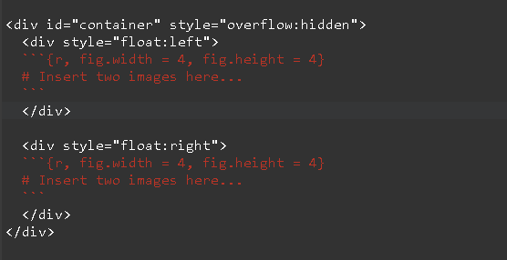
Note that the function returns a list of four plots. Unlike par(mfrow = c()) we’ll use <div> tags to arrange the four plots in a matrix like layout of 2 rows and 2 columns. Use the fig.width and fig.height chunk options to set appropriate plot width and height. Simply use double square brackets [[]] to refer to each figure and print the same. Or you could use print(). See image below.
Image may be NSFW.
Clik here to view.
The output should look like this:
Further Resources
This post hopefully helps you get started with Ploty and using it in R-Markdown documents. Refer to Plotly’s Figure Reference for more details.